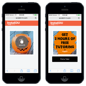
This month, we saw many wonderful Halloween Scratch-it campaigns. Some had scarecrows, one was in an app, and another received stunning results with a CTOR rate of 75%. However, we would like to take a moment to compliment and critique one scratch-it that stood out in particular because of it’s simple but provocative design.
Launched this week, InstaEDU’s Halloween Scratch-it email campaign offered 2 hours of free tutoring. What we loved about the campaign was that they kept it very simple. There call to action button reiterates their scratch offer creating a cohesive story arc, while maintaining a attention ratio of 1:1
If you click the “find a tutor” redeem button you are transferred to the Instaedu homepage. Once landing on the site your eyes immediately gravitate to the two hour free offer in the right hand corner. By being direct Instaedu is able to reduce the customer friction as customers have a clear indicator of where to go to take advantage of their offer.
The scratch-it, which was spread via email, served as both an engagement piece, as well as a unique way to boost conversions with a younger demographic. By concealing the message the scratch-it compelled viewers to engage on a deeper level, driving the audience to the site.
We asked a few local Portland State University students if this offer would appeal to them and the response was very enthusiastic:
“I think the offer is great. There are always subjects I need help in, to know that there is a company that is out there to help, and one that I can trial for free before committing, makes me far more receptive to using it”. – Rebecca – Design Major
“I had never heard of them [Instaedu] before, but after seeing the offer it will definitely be on my radar when I need help with Calc this term. “- Henrik S. – Electrical Engineering
“I love halloween, I need help in school, and I was definitely enticed by how they created a reveal a deal offer I could use on my phone with my finger. Awesome Job Instaedu.” – Claire S. – Business Major
Takeaway: Headline & Call to Scratching (CTS)
The better the headline, the better the CTOR. Keeping in mind the story arc, the headline needs to be directly related to the subject line, and the image displayed in the email. This is what will drive a reader to begin scratching by including a relevant headline and an enticing scratch-it. Instaedu compelled their viewers to take a deeper look.
Best Practices
• The scratch image should be almost identical to the email image.
• Do not display instructions on the actual scratch image.
• Limit the text on the scratch image.
• The content of the image should be consistent with the story and offer
Congratulations Instaedu!
Want to try a Scratch-it? Click here to schedule a call.


Pingback: Reveal based marketing - see this talk with Robert HaydockMichael Leander – marketing speaker, marketing trainer()