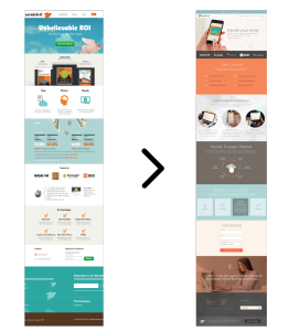
Release the balloons and kazoos! It’s party time at Scratch-it. We recently celebrated our 1 year anniversary and used the occasion to give our visual identity a spruce up. We made this change to better express ourselves in a way that resonated with out target audience.
It was a wonderful experience at times, stressful at others, but we’ve learned a lot and wanted to share with our community 10 tips that we’ve learned from our own experience. If you have any questions about our experience, feel free to email or comment below.
With no further ado, lets begin:
1. Project Strategy
Before you start, it’s important to seriously think about whether you should redevelop your visual identity in the first place. A word of advice: If your target audience is changing, or your message is not being well received, it may be time to consider a new visual identity.
The first step of any major change to your visual identity is to do an analysis of the organizational and financial impacts of the implementation. It is key to keep track of all costs to ensure that there are no unpleasant surprises for you at the end.
When strategizing about our visual identity we had our customers at the forefront. Through studying user case studies we began to develop an idea of what customers would need to know about our email marketing software to feel comfortable purchasing from us.
We also focused on recreating our customer success material to ensure that once a customer had purchased, they would be met with the information needed to succeed. To successfully pinpoint the pieces we were missing we conducted a survey amongst out clients.
Takeaway: Your customers are your best critics. Give them the chance to voice their opinions, and you’ll come away with a better realization of how to begin.
2. Set Deadlines
Creating a new visual identity takes time, and as you all know time = money. To ensure that we were moving rapidly and not wasting time on small details it was necessary to prioritize and set deadlines. These deadlines were important for us to gauge what were realistic targets, versus what was unnecessary.
Takeaway: Make sure to have clear and realistic deadlines set up ahead of time, they won’t always be accurate, but they will help to keep you on target and save money.
3. Customer Feedback
Create a small network of customers you trust and include them in the process. By including your customers, you will gain valuable insights into what they want you to add. When we were in the process of creating our new visual identity, many of our customers reached out because they loved certain aspects of our existing design and didn’t want those features to change. By keeping customers in the loop, they will give you needed feedback and will be more receptive to new changes.
Takeaway: Transparency is the key to building trust. Make sure customers are involved in the planning stage.
4. Appoint A Project Manager
In order to stay on task, manage resources and a budget, it is important to have one person in charge and to be held accountable for progression. Choosing this person can be tough, as much of their day will be concerned with executing the plan.
For an unbiased perspective, we chose to hire an outside consultant Ben Thompson of Studiofluid to lead the transformation. Change isn’t easy, hiring an outside consultant was important in letting us know what we should change, and how to stay on task, even when we didn’t want to hear it.
Takeaway: It can be tempting to manage as a team, however what we’ve noticed is by having one particular person in charge of managing time, work, and deadlines we were able to complete our vision faster and more efficiently.
5. Emphasizing Collective Voice
Include employees in the planning process as much as possible. At least one person from each role needs to be involved. In the discovery process of our new visual identity we had employees from Sales, Marketing, Customer Service, Development, and Finance. Our new visual identity shows our company and values, so it was important to us that everyone felt their voice was heard.
Takeaway: Make sure all voices are heard; you never know who has a brilliant idea or concern that could be pivotal to development. Further, make sure that you like your design before you implement. It’s never fun to have to wait, but nothing is worse then a redesign that lasts for a week.
6. Turn Your Strategy Into Something Everyone Can See
Now that the strategy was established, it came time for a spruce up.
After taking in all of the feedback and the content we discovered from our team discussions, we began transforming our strategy into a visual masterpiece. For this evolution of our site we chose colors and visuals that 1) spoke of our culture and 2) resonated with our audience. We were able to do this by being playful but direct in our copy and choosing photos that represented our product and the people who would use it.
When building out your new design it is essential that your customer facing ‘look’ can be used on a variety of media and products. You’ll want your logo to look the same on a t-shirt as it does on your business card. In our experience, the brand you’re presenting shouldn’t be too abstract or difficult to understand – it may be tempting to create a sophisticated logo, but it’s better for your logo to be instantly recognizable.
Takeaway: While it can be enticing to add lots of bells and whistles, at the end of the day what’s important is how customers perceive your design. If it is all over the place, it will be confusing and you’ll lose brand awareness.
7. Update Everything
You have a shiny new logo and visual identity, so now it needs to go live on every single branded communication. Updating your website, email templates and social media is the easy part. It’s revamping all of you marketing materials, brand identity materials, and swag that can seem daunting. If you squash this task immediately it will be easy, if you let it linger it will haunt you down the line.
Takeaway: A rebrand is more than a change for public perception, it is also a rally point internally. A rebrand gives your organization a chance to separate itself from all others. Make sure to update everything, you’ll be happy when it’s done.
8. Rallying the Troops
Our team is on the smaller size so we were lucky to be able to keep everyone onboard during the strategic process, but for a huge company this is not a possibility. If you’re large or have a remote team it is vital that you educate them on the reason behind your transformation. Even better is if you can include them in the planning process (see #5 above). It is important that all of your employees understand the reason behind the new visual identity and how a consistent image will benefit them directly. You must give them the support to evangelize your new identity, if your own employees don’t believe in it, customers never will.
Takeaway: If your employees don’t know why your making these changes, your customers surely won’t – give them support.
9. Let Your Customers Know
Some people think creating a new visual identity should be a secret. A behind the scenes job. The truth is your customers are going to immediately notice the change, so why not take advantage of this.
Takeaway: Re-launching your website with your new visual identity is the perfect time to educate your customers on why you changed, and how you are keeping their best interests at heart. It is an opportunity to reach out to those that matter most.
10. Measure and communicate brand impact
Occasionally when you overhaul your visual identity the results are immediately positive or negative – Ask GAP, their rebrand lasted for a total of 6 days. However, other times it is not as easy to see, which is why it is crucial to have a system set in place that tracks the impact of your project.
We measured our new visual identity efforts using analytical tools for social media, website traffic, and mentions, to see how people were interacting with out website. Then we measured these results versus different segments of our old identity to see if our new ‘look’ and ‘feel’ was resonating with our target audience, drumroll please… it was!
Takeaway: Before implementation identify the tools you need to monitor your success.
“Branding is not about applying a paint job or creating a new visual style. It’s a team alignment process that begins by articulating company culture and values. Those attributes are distilled into a unified voice and applied consistently, so that every customer touchpoint—whether visual design, copywriting or customer support—creates a familiar customer experience.”
– Ben Thompson, Creative Director at Studiofluid
Creating a new visual identity is a long and daunting process for most companies, but with some courage, a well defined plan, and these 10 tips, you can create a new look too.

